Collection · 8 entries
Posters with a clear hierarchy
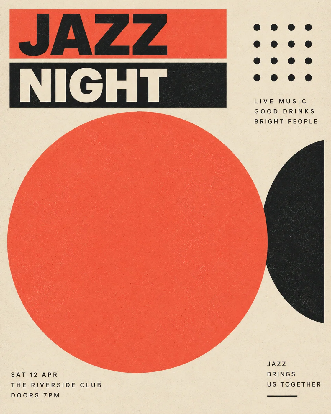
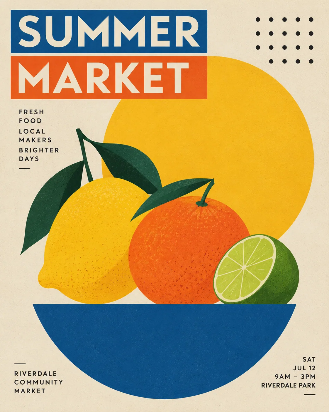
Posters where one shape leads and every other element has a stated place.

Each of these prompts says where its shapes go. That single habit keeps flat posters from turning into confetti.
What do they have in common?
- One dominant shape, named first and given a position.
- Bars instead of lettering, so the layout survives without readable text.
- Four colours at most, plus the background.
020002
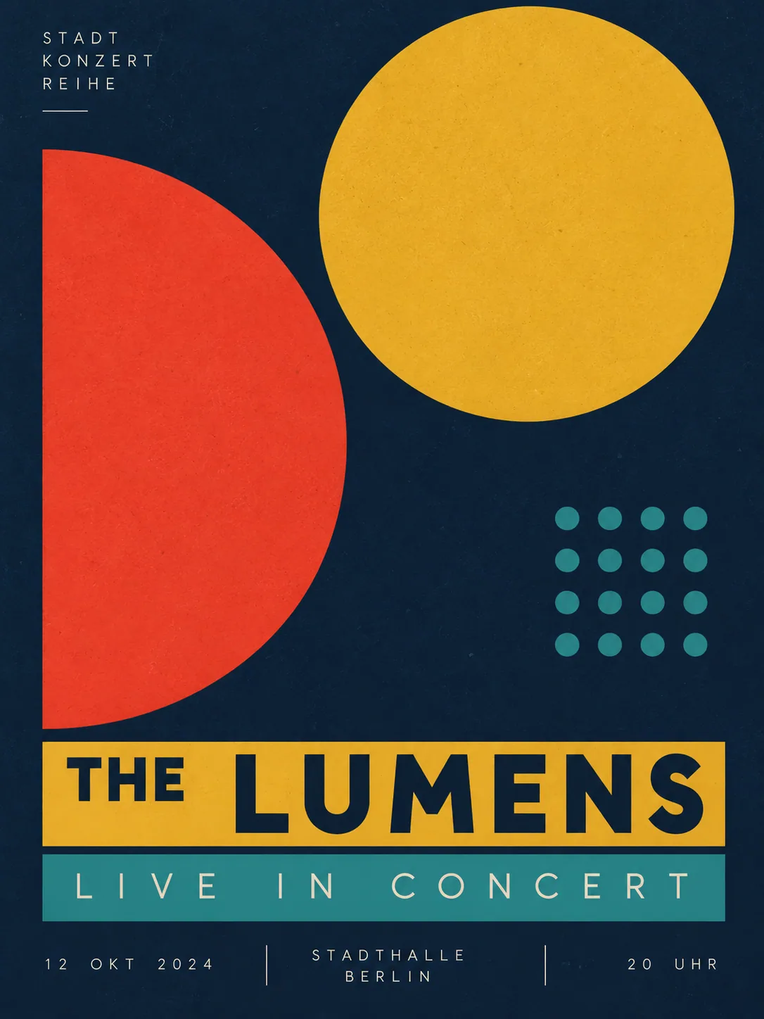
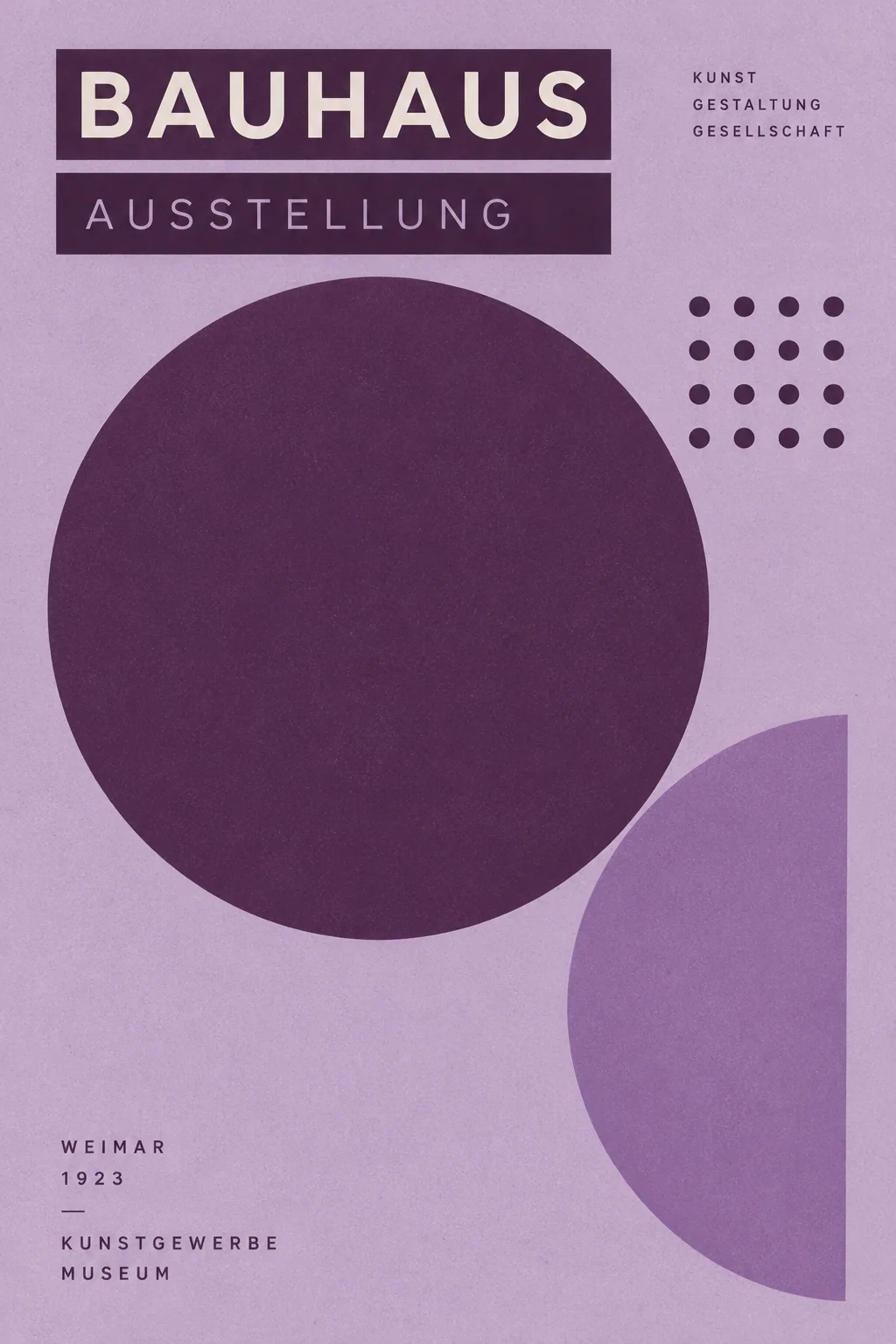
Geometric concert poster
The same structure as the jazz poster, with the disc and the half circle swapped.

More collections
 Asset concepts and mascots
 Spatial design and architecture
 Posters and information design
 Product and commercial visuals
 Design AI Prompt Top 60
 Art and playful worlds
 Information and visual stories
 Brand and commercial design
 Photos into characters
- Social image inspiration · Top 50
 Quiet landscapes